In the dynamic realm of retail the significance of visual merchandising cannot be overstated. Traditional brick-and-mortar establishments have long capitalized on the artful orchestration of captivating shop windows, strategically placed bestsellers, and clever checkout desk arrangements — all aimed at enticing customers to make impromptu purchases. Yet, what if we told you that the magic of eCommerce visual merchandising isn’t confined to the physical aisles of traditional stores? Contrary to common belief, this impactful marketing strategy seamlessly transcends into eCommerce, proving its prowess in influencing consumer behavior and driving sales. Let’s delve into the transformative power of visual merchandising and explore how it becomes a game-changer in the competitive landscape of online retail.
Why is eCommerce Visual Merchandising Trending?
Online retailers are now recognizing the pivotal role of visual merchandising in differentiating their digital spaces from external selling channels like Amazon and Facebook. As brands increasingly adopt omnichannel strategies, the need to stand out on their own websites becomes paramount. With limited control on external platforms, the website emerges as the hub where brands can craft unique and controlled experiences to capture user attention and drive conversions.
The essence of eCommerce visual merchandising lies in its ability to deliver tailored experiences. By strategically showcasing the most relevant products and compelling offers at every touchpoint, brands can captivate user attention, thereby enhancing engagement and prolonging the time spent on their site. This personalized approach extends to showing the right products to the right audience at the right moment, optimizing conversion rates and elevating average order values.
Moreover, online visual merchandising serves as a powerful tool for brand identity cultivation. By employing visuals in a distinct and recognizable manner, eCommerce retailers can convey their brand’s personality, fostering a strong and coherent identity that resonates with their target audience. In a digital marketplace teeming with options, creating a memorable and distinctive brand identity becomes a crucial differentiator.
Ecommerce Visual Merchandising Key Elements and Best Practices
Visual Storytelling
Visual storytelling gives your online store and brand a unique personality. Moreover, if your story conveys common values or shows how your brand solves customers’ pains, they will spread your story beyond your website, increasing reach and creating a community around your brand.
Here’s your guide to adding that storytelling touch to your eCommerce strategy:
- Get to Know Your Audience
It’s like getting to know a friend – understand what makes them tick, what they love, and what makes them smile. Create your buyer persona and tailor your stories to resonate with your audience.
- Tell Your Brand’s Story
Every brand has a story, just like every person has a history. What’s your story? Share it in a way that feels genuine and authentic, creating a connection beyond just transactions.

Collaboration of Honda & Monster is a great example of storytelling that went beyond the brand’s products and services.
- Create a Visual Picture
Think of your products as characters in a story. Use high-quality images and creative displays to visually tell the tale of how these products fit into the lives of your customers.
- Create Engaging Multimedia
Throw in some multimedia elements – a video here, an interactive feature there. It’s like adding illustrations to a good book; it brings the story to life in ways words alone can’t.
- Let Customers Speak
Customer testimonials are like the plot twists in your story. Feature real experiences to build trust and authenticity, letting your customers become part of the narrative.
- Make It a Journey
Your website is the map, and every click is a step in the journey. Guide your customers through a narrative, making the shopping experience more than just a transaction; it’s an adventure.
For instance, Lovetodream.com guides customers seamlessly through various stages of growth, such as Newborn & Swaddling, Ready to Roll, and On the Move. Each stage presents related products while sharing engaging stories that provide insight into their purpose and benefits. As customers progress to the next stage with their children, this personalized journey fosters a connection, making them more inclined to continue their parenting journey with this particular brand.
- Keep It Consistent
Imagine reading a book where the characters suddenly change names halfway through – confusing, right? Keep your storytelling consistent across channels, creating a cohesive experience.
- Watch, Learn, Adjust
Just like any good storyteller, keep an eye on your audience’s reactions. Pay attention to analytics, listen to feedback, and adjust your story based on what resonates.
Website Layout
The layout of your website is the canvas upon which your brand story unfolds. A well-crafted design not only enhances user experience but also plays a crucial role in delivering your brand narrative effectively. Consider the following key elements when optimizing your website layout for impactful brand storytelling and eCommerce visual merchandising:
- Visual Hierarchy
Establish a visual hierarchy that prioritizes essential elements of your brand story. Use strategic placement, sizing, and color to direct attention to key messages, products, or narratives.
- Engaging Imagery
Incorporate high-quality images that align with your brand’s visual identity and storytelling theme. Visuals should not only be aesthetically pleasing but also contribute to the overall narrative.
Consistent Branding
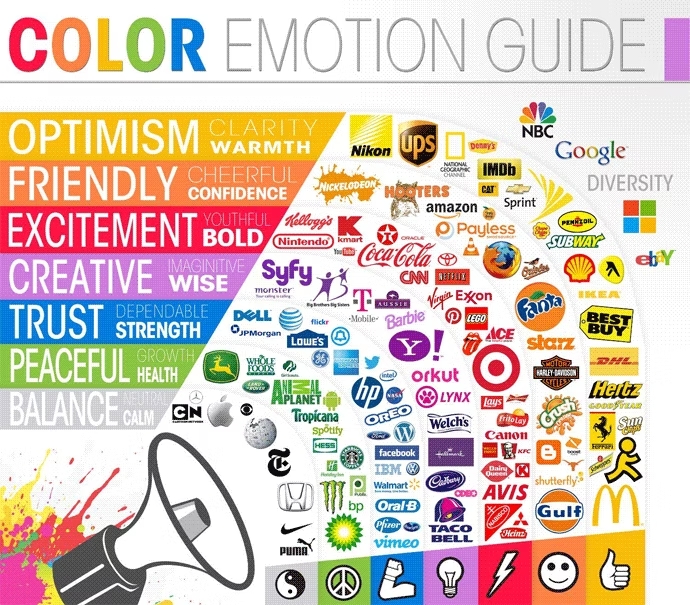
- Maintain consistency in branding elements across all pages. From color schemes and typography to logos and imagery, a cohesive look reinforces brand identity and aids in story continuity.
Credit: The Logo Company
- Mobile Responsiveness:
Ensure that your website is optimized for mobile devices. With a significant portion of internet users accessing sites via smartphones, a responsive design guarantees a seamless experience across various screen sizes.
- Interactive Features:
Integrate interactive features that encourage user engagement. This could include quizzes, polls, or multimedia elements that enhance the storytelling and shopping experience, making it more dynamic.
- Clear Calls-to-Action (CTAs):
Strategically place clear and compelling CTAs that guide users toward desired actions. Whether it’s making a purchase, subscribing to a newsletter, or exploring a specific story, CTAs play a crucial role in directing user interaction.
Be Sure You Provide Users With Excellent UX
Ensure Smooth Navigation
Customers seek a seamless and intuitive journey, much like navigating a physical store. When visitors land on a website, they’re on a mission. The goal is to find what they want as effortless as a stroll through a well-organized physical store. Every part of your layout should have its place, is easy to find, and looks fantastic. Clear categories, intuitive filters, and a search function that works seamlessly – that’s what provides a great shopping experience. Make it so easy to navigate that customers won’t have to think twice about finding what they’re looking for. Here are some tips on improving your navigation:
- Simplified Menu Structure:
Streamline your menu structure, organizing categories logically and minimizing clutter. A concise and well-organized menu simplifies user choices, making it easier for them to explore your brand story.
- Descriptive Labels
Use clear and descriptive labels for menu items. Avoid jargon or ambiguous terms that may confuse users. Each label should provide a straightforward indication of the content or section it leads to.
- Visual Cues
Incorporate visual cues such as icons or images alongside navigation labels. Visual elements help users quickly associate each menu item with specific content or actions, enhancing clarity.
- Consistent Placement
Maintain consistency in the placement of navigation elements across pages. Users should easily locate the menu, whether it’s at the top, side, or bottom of the page, ensuring a predictable and user-friendly experience.
- Search Functionality
Implement robust search functionality. A clear and easily accessible search bar enables users to quickly find specific content, products, or stories, particularly when navigating through a vast narrative.
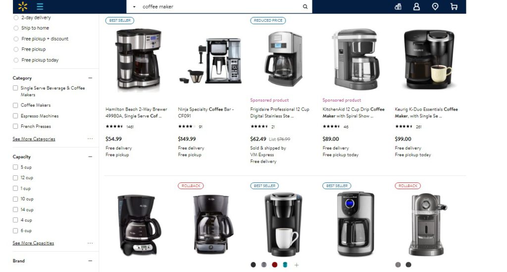
Advanced Search Filtering Options on Walmart
- Breadcrumb Trails
Include breadcrumb trails on pages with multiple levels. Breadcrumbs offer users a clear path back to previous sections, maintaining orientation within the overall narrative and reducing confusion.
Create Outstanding Product Pages
Even in today’s digital age, a significant chunk of customers still cherish the traditional joy of exploring brick-and-mortar stores. For them, the ability to touch and try on products is a game-changer in the decision-making process.
Now, online retailers face a unique challenge – replicating that tactile experience virtually. While some of them are exploring cool tech like virtual fitting rooms, the immediate fix lies in perfecting product visuals and descriptions.
When customers are scrolling through online aisles, those product photos are make-or-break. Don’t skip money on high-quality imagery. Invest in top-notch, crystal-clear images and videos that showcase products from every possible angle. Zoom in on those intricate details, throw in some shots of real people using your products, and why not sprinkle in a few photos from satisfied customers?
But it’s not just about the looks – it’s about helping customers really know what they’re getting. Alongside those eye-catching visuals, serve up descriptions that are as clear as a sunny day. Sizes, colors, specs – lay it all out. Empower shoppers to make informed decisions, just like they would in a physical store.
In essence, for those customers who still crave that hands-on shopping feel, the success lies in mastering the visuals and descriptions. It’s the bridge between the online and offline worlds, ensuring users feel just as confident shopping from our screens as they do strolling through a store.
Checkout Optimization
The online checkout experience differs significantly from traditional brick-and-mortar stores. Online transactions lack the personal touch and immediate assistance found in physical stores, and customers face potential distractions from various online elements. Security concerns, the inability to physically experience products, and the need for transparent policies add additional layers of complexity.
To overcome these challenges, online retailers must prioritize a streamlined user experience, providing clear and transparent policies to build trust. Visual merchandising techniques on checkout pages can be employed to showcase related items or exclusive offers. Responsive customer support, optimization for mobile users, and emphasis on security features contribute to a more reassuring online checkout process. Check our post “Checkout Optimization Tips” for more practical recommendations.
Final Words
In the bustling world of online retail, nailing visual merchandising is the key to a standout. From vibrant product visuals to seamless navigation, creating an engaging online experience caters to the diverse preferences of customers. It’s not just about selling products; it’s about weaving a compelling digital narrative that keeps customers coming back for more.
 Mobecls team provides a wide range of eCommerce development services, starting from SEO and design to custom functionality development. Our 10+ years of Magento expertise allow us to provide unique eCommerce solutions taking into account industry and business specifics. We’re here to help your business grow!

