Your landing page is the center of your digital marketing strategy, whether it’s for the debut of a new product or a short offer to create traffic or improve sales. You direct the traffic of search engines, social media, or e-mailing initiatives toward it.
Landing pages differ from the rest of your website in that they have a specific aim, whether instructional or transactional. The ultimate goal of any landing page is to turn your online store visitors into customers. In this article, we’ll share some tips on eCommerce landing page optimization.
Tips on Creating a Converting eCommerce Landing Page
Create a Relevant and Targeted Page
Many organizations ignore providing a unified experience across their advertisements and landings. After clicking on the link or banner, the design, message, and tone must be congruent with user expectations.
Users may leave believing they are in the wrong place if your landing page does not match the style of your ad. As a result, your landing page’s design and original message must be identical to your ads.
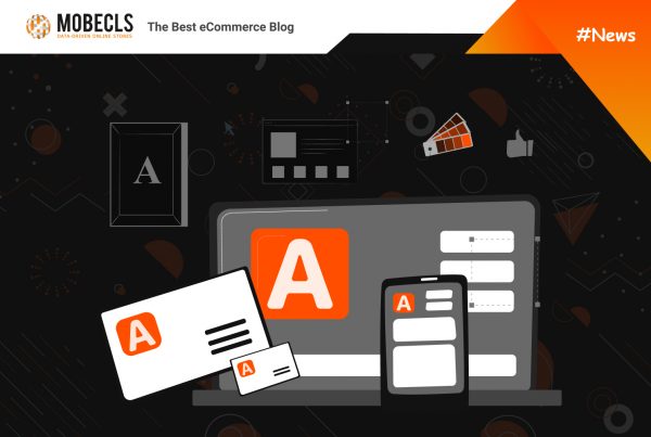
Make Use of a Great Title and Subtitle
A strong landing page, beginning with the title, uses action-oriented language. This title should base on the promise made in the link that led the visitor to your landing page. As a result, the titles must be consistent with and fit the user’s request.
Users are interested in knowing where they should go, what they should do, and how they should do it. Because of this, the most effective landing pages focus the reader’s attention on a clear, brief, and easily identifiable title that speaks directly to their goals, desires, worries, or issues. The subtitle presents the content: it should be succinct and to the point in order to entice the reader to keep reading.
How To Create Converting Product Pages In Magento| Adobe Commerce
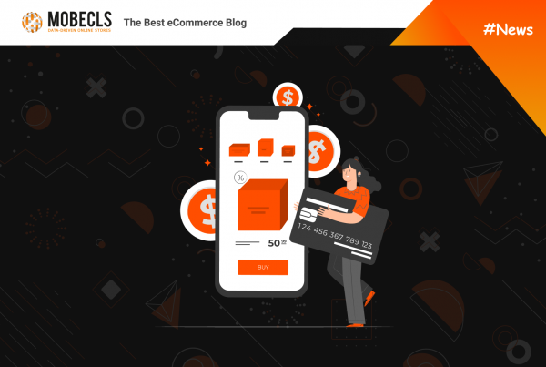
Add Strong Call to Actions
Except for your title, the call to action (CTA) is the most crucial element of your landing page. It corresponds to what you want to get from your visitor.
Actions can correspond to:
- The acquisition of a product
- Newsletter subscription
- A contact
To show its authority, make sure your call-to-action button has depth and contrasting colors to the surrounding elements. Some specialists argue that red is the best color to employ since it elicits powerful emotional responses, yet it also has negative implications. Experiment using other colors to fit your style: green is peaceful, blue is a common online color for links/action, and purple, which implies safety. Make your CTA stand out even more on the page by allowing it to breathe visually using white space.
Your CTA wording should be straightforward and unambiguous. To elicit an instant response, use action-oriented language or suggest urgency, such as “now” immediately or “start today.” Place your CTAs above the fold line. If your page is large, duplicate CTAs at regular intervals farther down the page. Visitors do not all react the same way to material, and repeating your CTA may make certain people more likely to convert if it coincides with their emotional connection to your message.
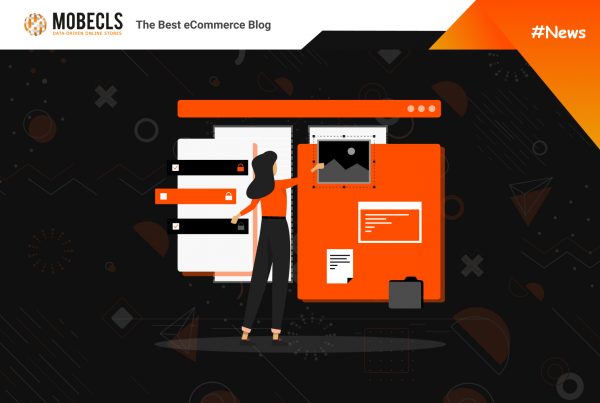
Keep It Clean and Remove Unnecessary Elements
Landing pages, unlike most other marketing tactics, take a straightforward approach. Less is more in terms of substance and design. Keep in mind that each aspect must have a purpose: to turn a visitor into a buyer. Remove any distracting components from your landing page to let the user focus on a single action. Keep the following elements:
- A single sidebar or footer that contains all of the opinions
- If visitors are not interested in your product, you have two navigation options: a button that takes them to the rest of the offer and a link that moves them to a specific page on your website.
- Off-page links that are required: terms and conditions, privacy policies, or social sharing buttons
- Images that support your message
Incorporate Social Proof
Applying social proof increases your reputation and is an excellent strategy to get trust. There are several strategies to capitalize on this psychological trigger. You may use the following as social proof on your landing page:
- Receipt of prizes/awards
- The logo of a well-known firm with which you engage
- Customer testimonials, ratings, and reviews that are favorable
- Mentions in the press
Because people value the views of others, the aim is to showcase a review that demonstrates how you have influenced someone’s life or business or simply positive comments given by your customers. Another way to leverage social proof for your landing page optimization is to mention the number of your customers.
Perform A/B testing
- To evaluate the success of new changes, A/B testing is one of the most critical pieces of any landing page optimization. Testing helps you compare your ad campaigns and determine which ones are more effective.
- Test the most critical parts first, such as titles, CTAs (message phrasing, color, and so on), and forms (number of fields), before moving on to less significant aspects.
- Create multiple variants of your core message and test each one. Change the font size and color as well. A small tweak can sometimes result in a greater conversion rate.
 Need Help to Enhance User Experience and Design of Your Online Store?
Mobecls team provides a wide range of UX/UI design services for eCommerce websites: eCommerce UX Audit, Magento Custom Theme Development, Magento Theme Optimization & Customization, Mobile App Design Development and more.