UX/UI Redesign
for Ferrari & Maserati Parts Supplier
for Ferrari & Maserati Parts Supplier
Intro
A Ferrari, Maserati, and Lamborghini parts and accessories one-stop supplier. The client offers one of the largest online catalogs of genuine Maserati and Ferrari parts, tools, and aftermarket performance parts.
The company has been one of the most prominent members of FerrariChat, the largest online Ferrari community in the world, for more than 15 years.
Services
UX redesign, UI redesign
Clients
Ricambi America
Business Problem
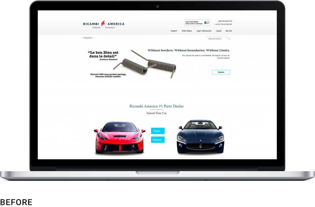
The client faced decline in sales due to outdated website design and poor user interface of the Home page:
- Poor On-Site Navigation;
- Messy Home Page;
- Poor Mobile Optimization;
- Non-Clickable Banners;
- No Popular Products and Categories Blocks;
- Unstructured Header and Footer;
- Unstructured Header.

Our objectives
- Clean and modern design;
- Improved on-site navigation and search;
- Highlight origin of products;
- Fast redirect of clients to Category pages from the landing page;
- Mobile-responsiveness.
Ricambi America Redesign
Our Approach
Our team aims to provide data-driven redesign and development services. It means that every decision we make is dictated by customer data and needs. We pay a lot of attention to user behavior, which helps to find out what works well on a website and what doesn’t. That’s why in the first stage of the redesign process we analyze Google Analytics data to find out the most and least clickable elements, popular category pages and products, etc.

What we’ve done to reach the objectives:
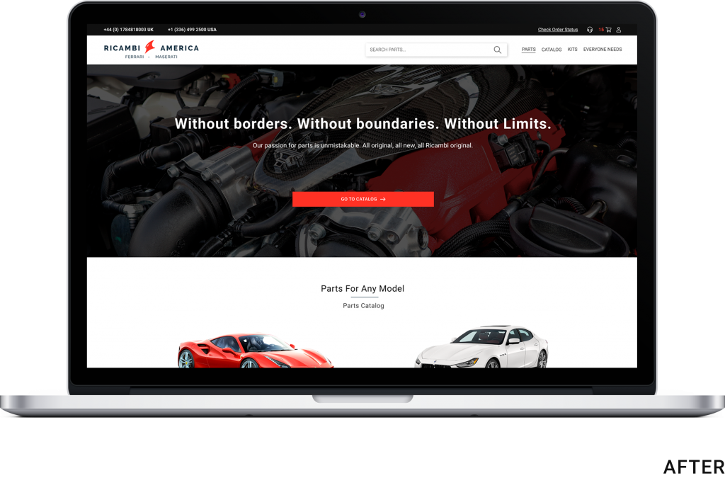
A more noticeable Search Bar and properly structured Header
The old search bar was too small and customers could hardly find it. A noticeable search bar is a must for every online store, especially for those that sell niche products like auto parts. It’s a more complicated product, customers often don’t know how the necessary parts are called and how they look. That’s why a search bar should be one of the first things they see after landing on a website.


We deleted unnecessary text blocks and
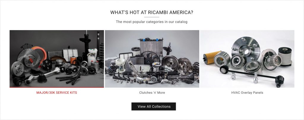
replaced them with Best Selling Categories and product blocks
This way, we encourage customers to land on product pages faster.
We added a new trust block with the statistics from the US’ largest Ferrari forum

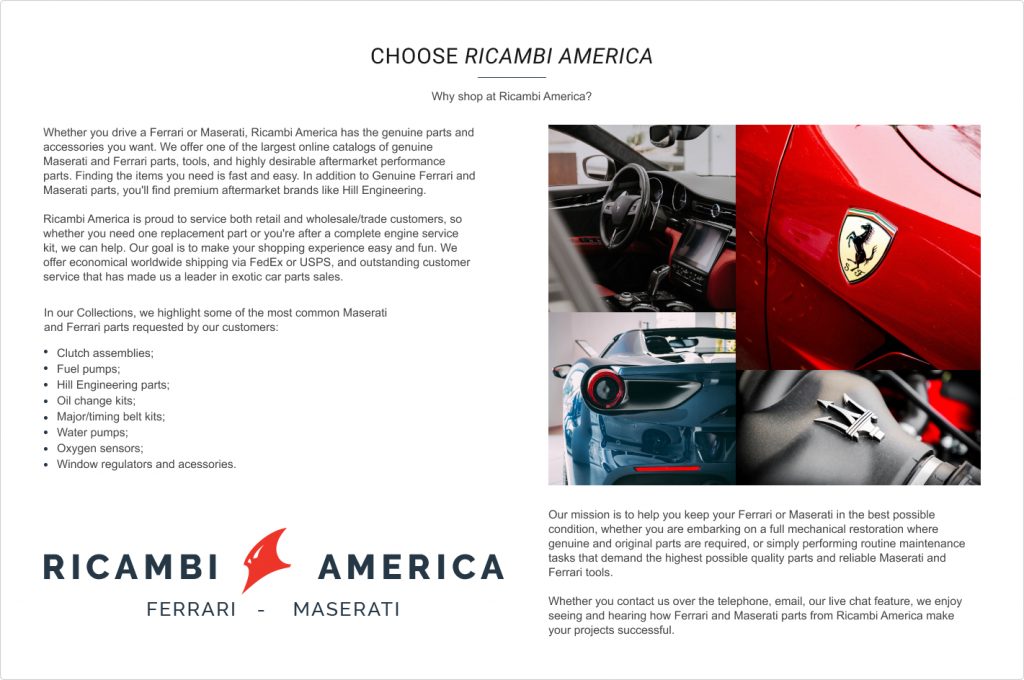
A new About Us text block to boost SEO and clients’ trust
A New Representative Banner with clickable elements
